Improving UX | UI of DurotimiAI.
A SaaS for early cancer prediction.
I enhanced DurotimiAI by analyzing the user experience with UX audits, competitive analysis, and user tests leading to prototype/ redesigning the interface for better usability.
Role
UX UI Designer
Tools
Figma / FigJam
Slack / Maze / Miro
Microsoft Azure / Teams/ Whiteboard
Case summary
User problem
Understand the product
Outcomes
Predict cancer in an intuitive SaaS without increasing the workflow. As well as prevent or recover from errors while filling forms to add combinations of signs, symptoms and risk factors to predict the probability of cancer. Enhance the user experience by filling forms, flow and interactions.
I met with stakeholders to gather insights on the business process and did secondary research on the audience: experienced and novice General Practitioners. Our team examined the primary product process blueprint to identify issues and develop solutions through a new design.
Reduce mental effort and prevent error while adding combinations of signs, symptoms and risk factors to predict the probability of cancer. Enhance the user experience by filling forms, navigation and interactions.
Panoramic of the project

Understand
the business

UX audit/
identify issue

Accessibility considerations

UX
research

Competitive
analysis

User journey
map

Information
architecture

Low / high Prototypes

A/B
test

Usability
test

UI
Iterations

Design to developer
UX audit
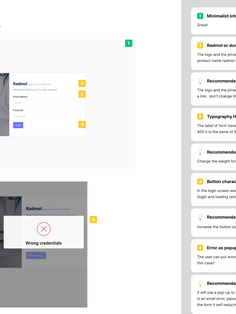
To assess how well the interface was adhering to the 10 usability principles, such as visibility of system status, match between system and the real world, and error prevention as well as accessible principle of contrast and typographic hierarchy. To identify issues related to these principles and provide recommendations for improvement.

Competitive analysis
The research of Patient Record Systems and AI-powered cancer prediction SaaS to identify best practices, evaluate user experience, and improve the pre-existing design.
User Journey maps
Creating these user journey maps helped visualize the steps and interactions a user goes through using the DurotimiAi. These tasks maps provided insights into the user's experience, identifying pain points and opportunities to guide the design process to improve the overall how the GPs experience the SaaS.


Opportunities
01.
Design consistency and brand identity
02.
Check the taxonomy and predictors
03.
Specify each prediction details
04.
Reduce mental effort filling forms
05.
Rearrange navigation flow
The usability study and issues uncovered
We performed an exploratory test with three users to observe the usage, behaviour and understanding of the original product. This stage aims to identify issues for resolution in the new design.
1
Lack of measurement units for alcohol and tobacco scales
2
Consistency issues in button design and labels
3
Navigation generate more click than necessary
Ideation
It was time to apply all the insights collected in the previous process to increase usability towards the goal
From this point, we reviewed the information architecture and did the A/ B test
to validate the easiest flow and solution.


and refactored existing ones based on the Material UI design system to ensure consistency, hierarchy and an aesthetically pleasing user interface. Also, I considered the accessibility guidelines of WCAG for colour contrast and hierarchy.


After the A/B test, I created the style guide components
Prototype
From low fidelity to high fidelity prototype with interactions
and animations ready for user test
Next steps
1
Next
usability test
2
Verification of predictor with oncologist
3
Add button
to get users feedback


